Best Practices In User Interface Design For Apps
Optimal mobile app design is all about personalized communication, a friendly voice, and intuitive interaction. In other words, it's a design that doesn't require users to think much and focuses on emotions, motivations, and needs.
Do you want to create a technologically advanced product that speaks to your users' heart? Then you're in the right place.
In this article, you'll dip your toe into the best mobile design practices of 2021 and learn how they can boost sales and retain users.
Nowadays, everyone is overwhelmed with a constant flow of information, so it's become much harder to create attention-grabbing products. Moreover, your product may be valuable, but if it's difficult to use, nobody will waste time on finding out how to do it.
Simple, human-centered design is the key to long-lasting client relationships. Not so long, having an attractive and unique product design was enough. But things have changed. The human-centered approach has completely replaced the system-centered one to become the main trend currently.
Modern design should reflect the latest tech innovations, so let's dive deeper into the main technological advances that are gradually changing our lives.
UX/UI design should always harness the best of technology, that's why it's essential to use the latest software and hardware design. Let's review what's hot right now:
1) Mass transition from 4G to 5G mobile data transfer
The era of 5G is already launched in a number of countries and is projected to evolve more and more. The highest maximum speed of 5G is 2.7 times faster than 4G and will have a huge impact on design in the near future: boring loading screens will no longer be relevant, and detailed data visualisations (which is impossible at current speeds) will become a reality.
2) The growing popularity of instant apps
Today, you don't need to download a fully functional app just to access a certain tool it offers. Therefore, UX/UI design should be adapted to instant apps and not overwhelm the user with features they don't need.
3) Internet of Things adoption
According to global statistics, the average person owns 6.58 Internet-connected devices. And it's not only about phones, tablets, or even smart watches. Refrigerators, slow cookers, security cameras, door lighting systems are only a small part of the so-called Internet of Things. Of course, applications for appliances and wearable devices have different purposes, but both significantly drive modern trends.
4) Cloud solutions
The integration of cloud solutions in mobile apps is growing increasingly. Apps that run in the cloud significantly save the memory of our devices. What does it give to designers and developers? Cloud solutions decrease development costs and allow more resources to be directed to functionality and the user interface.
5) Passwordless login
Entering data into fields during the login process is a thing of the past. All modern devices use FaceID or fingerprint authentication, so there's no need to remember your passwords and interrupt your interaction with the app. This is one more step forward towards a simple, uninterrupted UI.
Now that you know how technology dictates changes in design, let's look at this year's best practices in mobile app design.
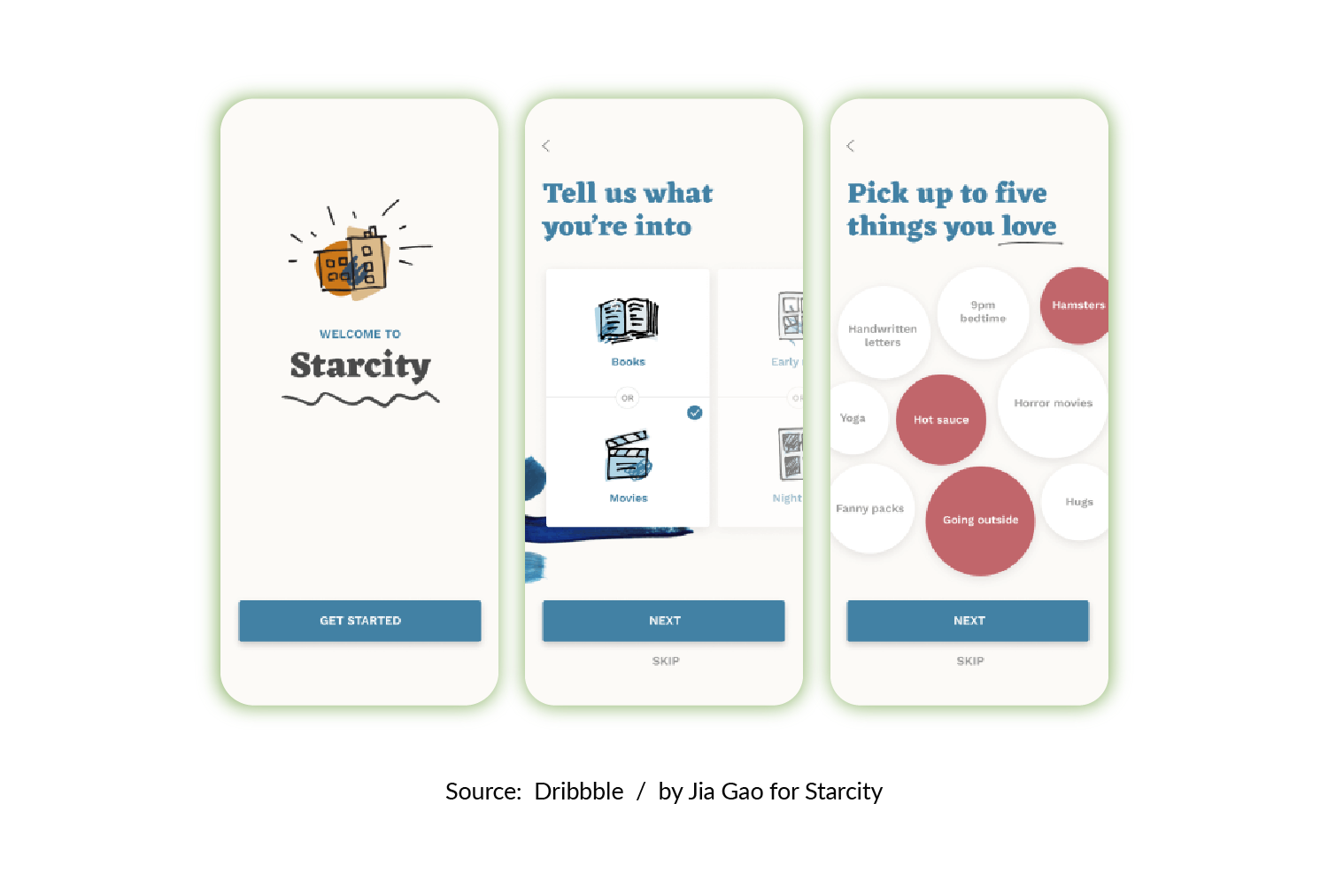
Dynamic and functional animation is the main trend in mobile application design. Let's review its benefits:
Animations and microinteractions catch attention and create the right mood, so there's no need to add clutter or extra text
Animations make applications more "alive", as users take part in a two-sided conversation between them and an application. Even such minor animations as changing the color of the active block or decreasing the title size while scrolling can improve the user's interaction with your app.
Personalized animation is another trend that creates connection between your product and the user
With personalized animation, the elements on the screen change according to the user's behavior. Modern analytical algorithms allow us to define the type of user and differentiate those who need detailed info from those who are just wandering around.
There are many strategies – including A/B testing, market analysis, and customer segmentation – for design adaptation and personalization. But the main goal of user-oriented UI is to adapt to customer needs, depending on their pain points and the stage they're at in their customer journey.
Source: Dribbble / by Jitu Raut
As we've mentioned, new data transfer speeds provide a lot of opportunities for creating realistic visual forms. Eye-catching and detailed 3D elements simultaneously perform such tasks as:
- Saturating your product with futurism
- Giving users a chance to observe, spin, and the size of the element, thus increasing the engagement and interest in your product
- Communicating information faster and better than text
In addition, interaction with 3D models is similar to the offline experience, where the customer can view and touch the product. Such an approach evokes emotions and increases conversions.
The process of designing and developing 3D visualizations remains somewhat cumbersome. However, investing resources in it will pay off, because a unique interface with gamification elements makes your product more competitive in the market.
Besides the 3D models of the products, we couldn't help but mention the comeback of 3D as an interface style. Skeuomorphism is a design principle in which interface elements mimic real-world objects.
After numerous ups and downs, skeuomorphism has been reborn under the name Neumorphism. Detail, shade, and lighting all increase the immersive experience and remove the barrier between the user and the application.
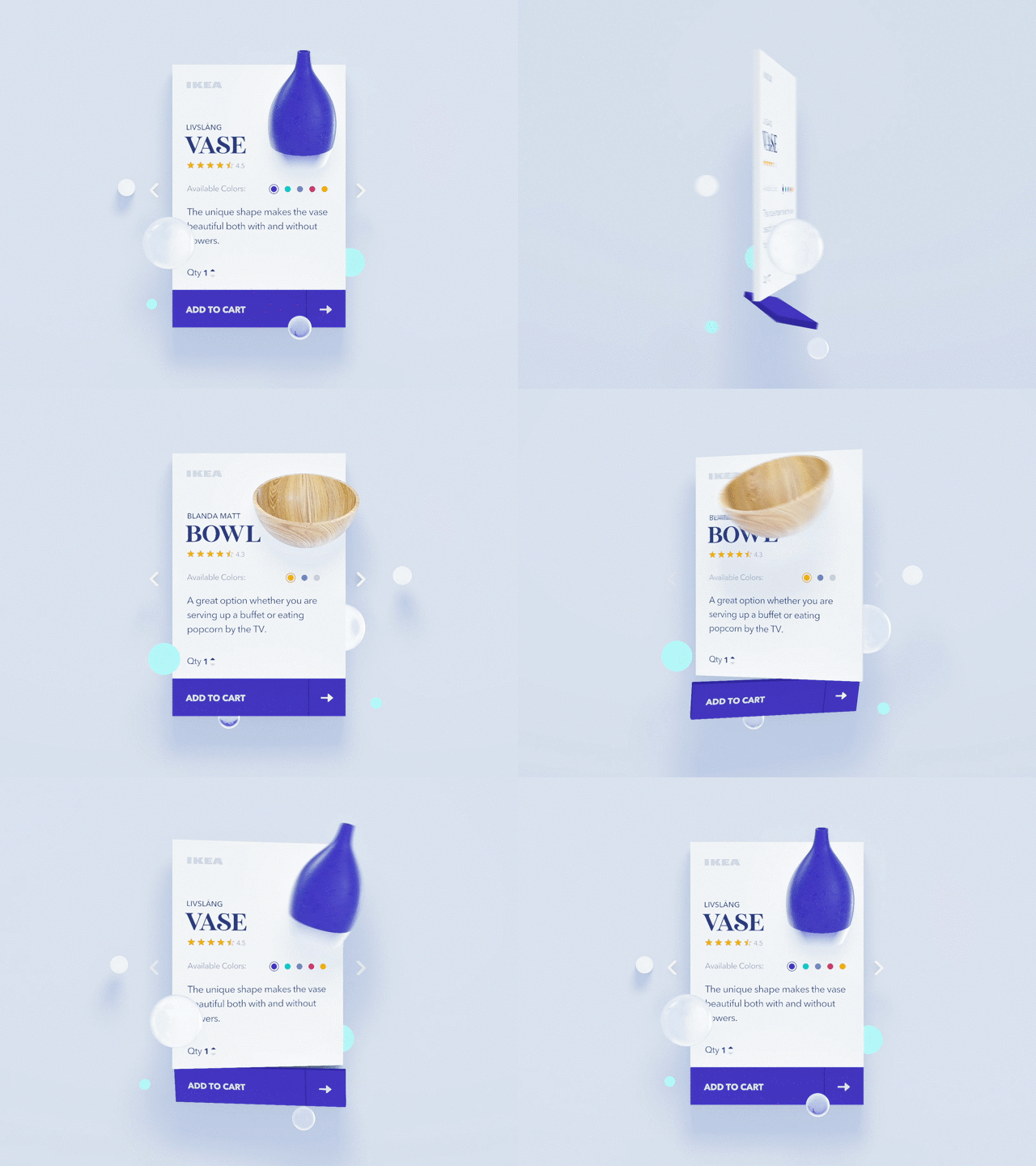
Source: Dribbble / by Voicu Apostol for IKEA
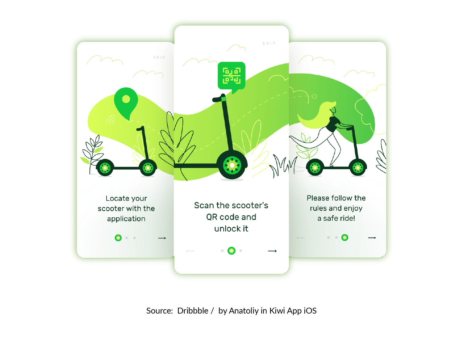
Storytelling is a way to interact with users in an engaging, simple, and consistent manner. Ideally, the story is an integrated narrative incorporating illustrations, animations, text, typography and flow.
What makes effective UX storytelling? It's the combination of short texts, informative illustrations, and an uninterrupted UI that constitute a single story.
Storytelling will not be effective when the user has to take various actions to move through the buying journey. Uninterrupted UI is all about smooth interaction with the product. Here's how you can achieve it:
- Use short notifications on the page instead of pop-ups and overlays
People feel uncomfortable when they have to provide fill in personal information (especially sensitive info), so your task is to ensure users that their info will remain safe and sound.
- Use dynamic UI
Modern design helps users interact with the app without any cognitive load. Give people a chance to change the product parameters, and add or remove goods without having to go back several steps. Dynamic UX is all about adaptive motions that focus on one goal.
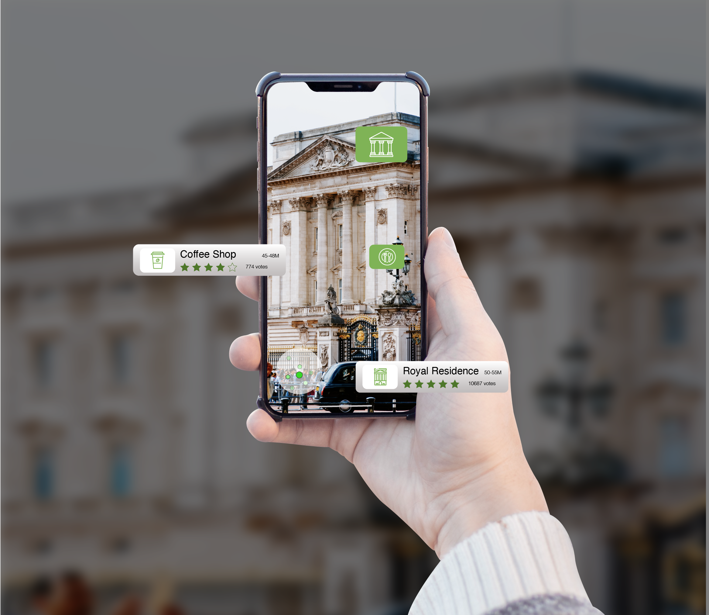
VR and AR extend far beyond gaming and entertaining apps – their elements are now a part of ecommerce, health monitoring, and beauty apps. VR and AR give us a feeling of connection with the product and help build trust in it. AR is also a great example of immersion that speeds up information processing and goal achievement.
VR and AR are new technologies that are only starting to penetrate the market. If you want to impress your users and stand out among your competitors, don't hesitate to make it a part of your design.
Source: Dribbble
According to statistics, the average attention span of humans has decreased, from 12 seconds in 2000 to 8 seconds in 2017. And it continues to decrease. Now it's more difficult than ever to keep someone's attention and communicate necessary information. That's why minimalism and simplicity are two UX/UI trends that won't go away.
Here's how you can make your application more minimalistic:
- White space
White space is the main characteristic of minimalism these days (line spacing and larger "aerial" margins between the information blocks are just the thing ). Such an interface doesn't contain many elements and makes it simple to interpret information.
- Hidden navigation panels and bars
It's become common practice not only to hide the menu categories under one small icon, but also to navigate through apps with the help of swipes, multi-taps, etc. The popular example of a buttonless solution is a liquid swipe, which provides a fully intuitive transition between pages and categories.
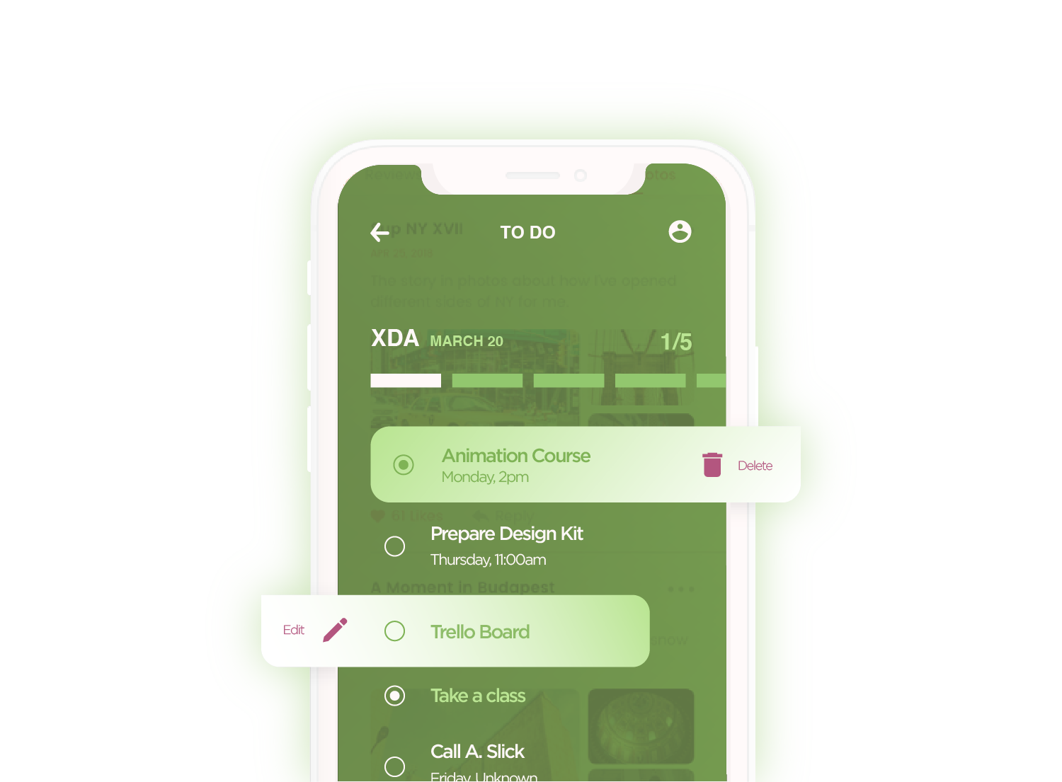
Applications with a dynamic UI change their form and appearance according to the device type and other external conditions. This, in contrast to a dynamic UX, where the interface changes depending on the type of interaction (not the look) and the user's behavior (not external conditions). A dynamic UI makes the app look perfect on a variety of different devices, from wide screens to smart-watch faces.
Creating a dynamic UI is simple and can include a variety of design methods. One such method is a card-based interface with adaptive block cards (little containers for information).
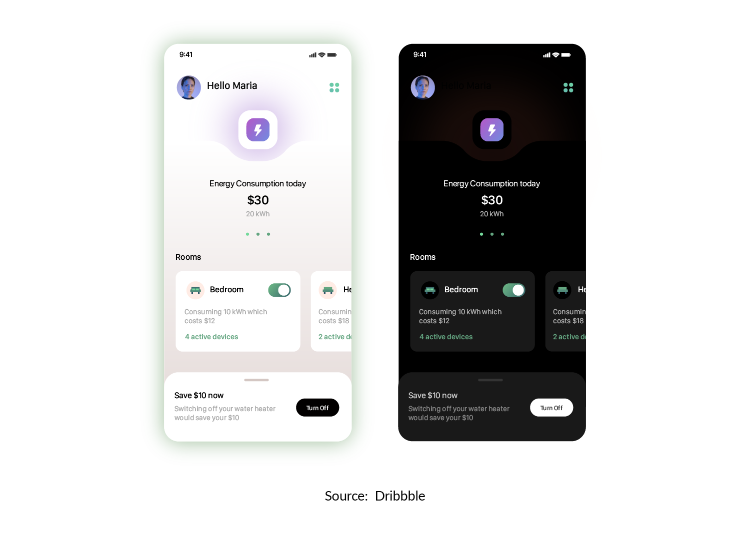
Another example of UI adaptiveness is the automatic switch to dark mode at night-time. The alternative to dark mode is a custom-set dark mode and the opportunity to dynamically switch color options. Another example of a decorative dynamic UI is the shadow on app elements that changes according to the angle at which the device is held.
By now, we're all used to having screens serve as mediators between the physical and digital worlds. But will this situation remain the same? While screenless wearables are only gaining in popularity and haptic technology is probably the element of the future, devices with voice control are already a thing.
Shipments of smart speakers are steadily growing, as are technologies for the detection and reproduction of different languages. Voice interfaces are becoming more commonly used in e-commerce, streaming services, and news apps. The chatbots that became popular several years ago have turned UI /UX into a live dialogue between the app and the user. As the adoption of voice interfaces grows, this dialogue will reach a completely new level.
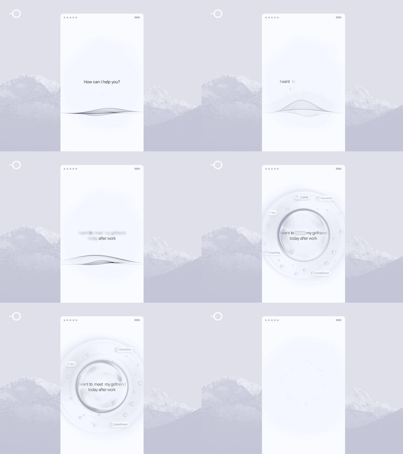
Source: Dribbble / by Gleb Kuznetsov
Today, trends in visual style put a lot of attention on typography. In previous years, applications mostly used simple sans-serif fonts. This year, old-fashioned serif fonts are in.
This doesn't mean that sans-serif fonts are a thing of the past. Quite the opposite: they will continue to be used to create simple and comprehensible texts.
However, if you want eye-catching headlines, serif fonts are what you need. A combination of different fonts better structures the text and singles out short information blocks from longer ones. Moreover, old-fashioned fonts draw the attention of users who quickly scroll down a page.
Another new tendency in the world of fonts is variable fonts. Variable fonts are single font files that allow for different variations in the style, proportions and weight of glyphs. These variations can be made at the design stage as well as in the feature, which will become a great element of customization.

UX/UI development
Create a stunning interface of your product.
Let's outline other visual elements that grow in popularity:
1) Gradients
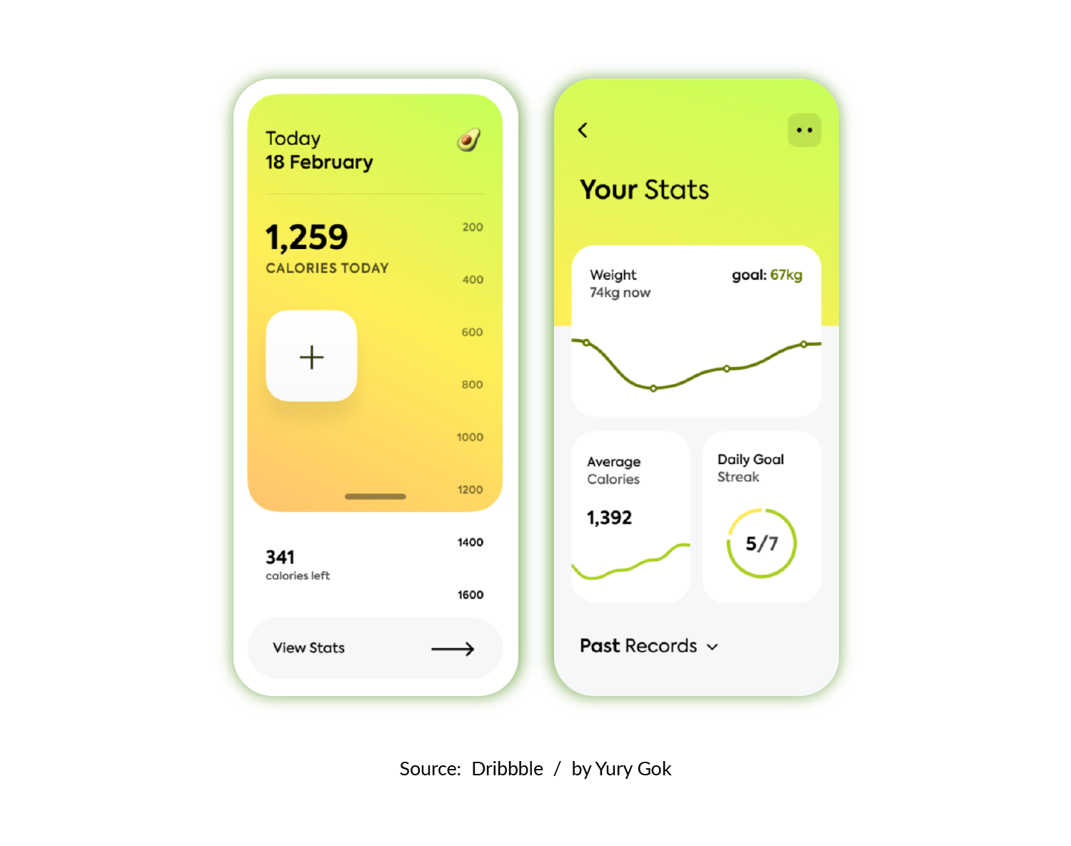
Gradients haven't lost ground for years. In the interfaces of new apps, it's trendy to use soft shades, smooth transitions, and more variable colors. Designers often use 2 or 4 main colors and their hues.
2) Translucency
Translucent colors saturate elements with lightness and allow you to single out different visual blocks without any additional load.
3) Rounded forms
Organic, soft, and asymmetric lines evoke feelings of comfort and safety. They're especially beneficial in products that people associate with stress (such as finance, e-commerce, real estate, and construction).
4) Bright neon colors
Futuristic shades of purple, pink, blue and green add the thrill of progress and novelty to the product.
- Make it responsive and adaptable to wearable devices
- Use animations and microinteractions. Let the design interact with the user.
- Show, don't tell.
- Stay minimal.
- Sometimes new is an overlooked old. Use Neomorphism and Serif fonts tastefully.
- Make use of faster mobile speeds for 3D graphics
- Add a voice interface.
- Increase personalization options.
- Go VR and AR. Break down the barrier between digital and offline reality: go VR and AR.
- Build an uninterrupted interface – from the first touch to the final goal.
A stunning product interface meets its user not only with a fancy visualization but also with a pleasant experience. So let's look closer at mobile UI best practices that you can use considering current trends.
When pursuing various trends, try not to scare away the user with confusing visual details. Instead, make navigation as simple as possible and the needed buttons easy to find.
Login walls are those forms that ask the user to log in before proceeding. For the user, this means additional time spent on registration and the need to remember passwords. In mobile design, best practices include
- guest access (to engage users before they have to log in),
- social network login (to avoid annoying users with the password typing),
- delayed login (that require users to log in only when they need access to a certain feature).
It's about uninterrupted UI again. When developing application design, best practices are to get rid of spinners, loaders, and progress bars. If any loading takes too long, it's better to give the user the rendered portion instead of standing idle until it's fully complete.
Although the diagonals of mobile devices vary, many users will be grateful if your application provides a convenient one-handed operation. (And you can combine this with other trends, for example, voice control.)
To follow mobile UX best practices, include in the push notifications relevant information and make them timely for the user to take needed action. This way, users will have a good experience and consider your app helpful.
To make a long story short, today's mobile app design trends are all about focusing on the customer and finding the best user-oriented solution. Try not to blindly chase trends, but find out what works best for your business and target audience. When you place your customer at the center of your design strategy, you earn trust and gratitude and build confidence in your product.
- Share
-
It would be great to discuss this article with you
Best Practices In User Interface Design For Apps
Source: https://djangostars.com/blog/best-practices-mobile-app-design/
Posted by: johnstontiledgets.blogspot.com

0 Response to "Best Practices In User Interface Design For Apps"
Post a Comment